Design Basics: How to Use the Typographic Hierarchy on Your Website
Typographic hierarchy sounds like a technical design term, but it’s a simple technique that you’re probably already familiar with. In fact, you see it used all the time in both print and online media. For example, If you look at any website, you will find that the text is the most important component of the website content. Images are added throughout the site to help generate interest, but ultimately, it is the typographic hierarchy that creates a cohesive, visually attractive, and interesting experience for your reader.
What is typographic hierarchy?
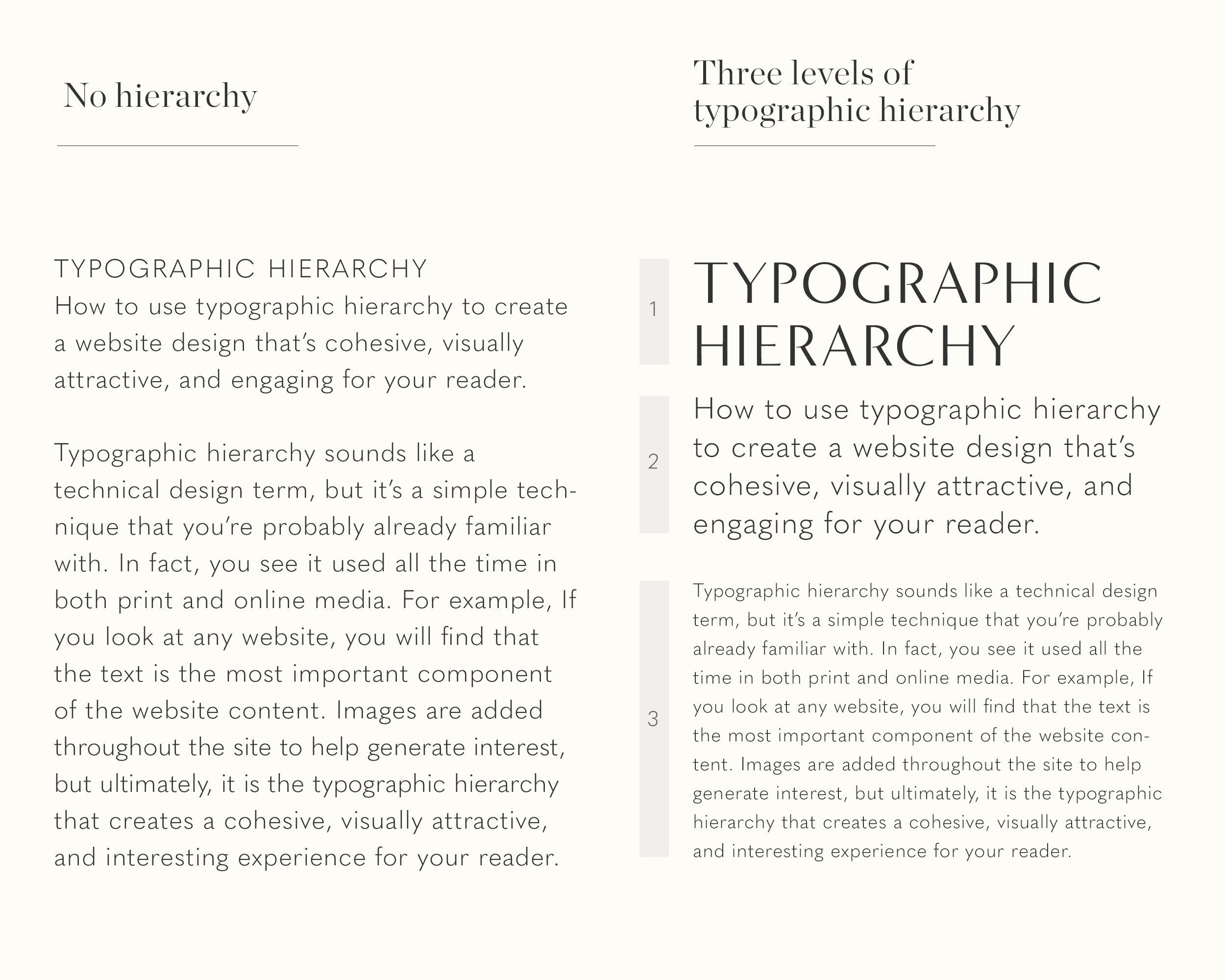
Typographic hierarchy is a way of organizing your content so that it’s easy for the reader to understand what is most important. It allows the reader to scan the information and easily navigate through the content.
So how do we incorporate typographic hierarchy into our website design? The easiest way to do this is to sort your typography into three separate levels.
Level One: Your level one typography is the most important content on the page. What do you want your reader to see first? It’s usually the big, bold font that first grabs your attention.
Level Two: Level two typography doesn’t stand out as much as level one, but it helps to visually sort the content into different sections. Think of level two typography as the subheaders; the items that give the reader clues about what they are about to read.
Level Three: This is where you want your readers to end up. If they were interested in your level one and level two typography, they will likely arrive at level three. Think of level three as the core of your message. This is where you can go into more detail about your product, service, or topic and it’s typically in a smaller font. It can be long like an article or just a brief description. The most important thing to remember about level three typography is that it must be in a font that’s easy to read since it’s typically much smaller than level one or level two type.
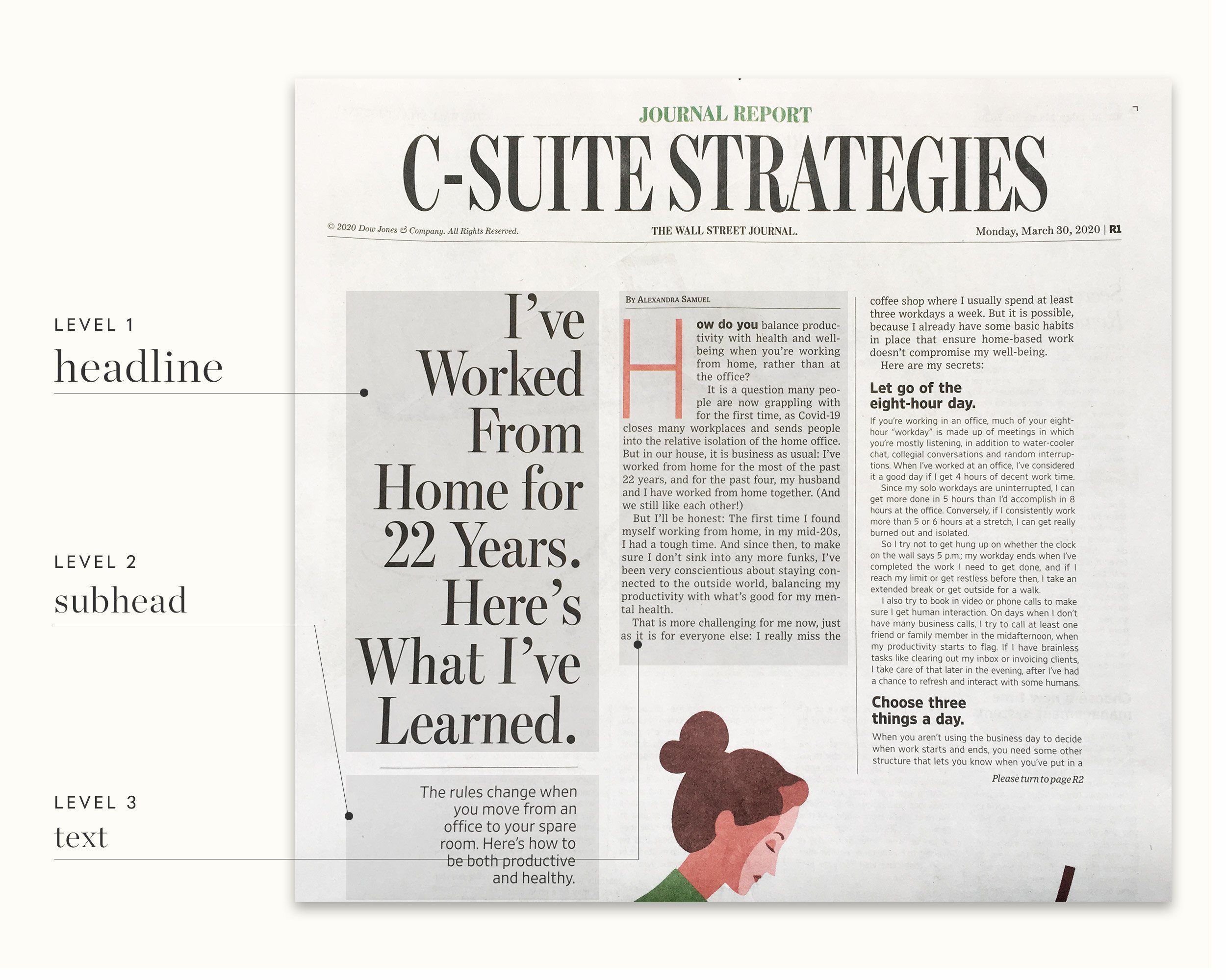
While we tend to focus most of our attention on digital media, you can see some excellent examples of typography hierarchy in print form. See if you can spot the different typographic levels in this newspaper.
How to create a typographic hierarchy
1. Use different typefaces and weights
As discussed in a prior post (link to post on typefaces), within each font family are several typefaces. Some examples include italics, bold, and condensed. These typefaces complement one another but still add some contrast. You could also experiment with different weights (light, medium, and bold). By using the same font family, your design will maintain a clean look and you won’t have to worry about pairing fonts.
2. Use different font sizes
Using different sizes allows the reader to quickly figure out which information is the most important. Naturally, we tend to read from left to right and top to bottom. So it makes sense to make the most important point large. If that interests the reader, they will continue it down to the next point, which is created with a slightly smaller font. Hopefully, they will then be ready to go on to the body copy in small print. It’s a progression that is natural to most of us.
Adjusting the font size is extremely important if you are only using one font. You can still achieve contrast by enlarging the important, level one elements while decreasing the size as you add level two and level three elements. Your reader will still be able to determine the important information at a glance.

3. Add white space
When we add white space to our layouts, we’re not only giving our reader’s eyes a break, but we’re creating a clean, easy-to-read design. White space also helps to keep your layout from getting cluttered and allows readers to easily distinguish one section from the next.
4. Use 2-3 typefaces for contrast
Contrast is a critical component in basic design. The most common font combination is a sans serif font paired with a serif font. This is a great starting point for your marketing projects. The one caveat is to make sure that the font combination is suitable for your project. For example, make sure your body copy uses easy-to-read fonts (no script please!).
5. Add some color
Color is a great way to accent or highlight an important piece of information. Colors can also add a particular mood or feeling (link to prior post on colors) to your design. However, remember to use color sparingly. When you use too many different colors, it becomes distracting and the reader will not know what you are trying to highlight.
6. Use spacing to help organize your information
Related design elements should be close to one another. Close spacing implies to the reader that the items go together. It also helps to create a sense of balance in the layout.
7. Experiment with subtle changes to the text
Designers sometimes tilt the text or have it wrap in a semi-circle pattern to create interest and draw attention. It’s a small change, but one that can have a great visual impact on the design.
8. Try adjusting letter spacing and line spacing
Tight letter spacing and tight line spacing can make a design appear cluttered, confusing, and difficult-to-read. Try gradually increasing the spacing and watch your design achieve a more simple and balanced appearance.
9. Use blocks of color and geometric shapes
If used sparingly, blocks of color and geometric shapes can highlight certain pieces of content. For example, to highlight a quote or an important piece of information, the text can be placed in a block of color or a geometric shape to draw attention to it. This can help entice the reader to continue reading the body copy.
Sometimes so much effort goes into writing the content, that some of the basic design aspects are neglected. While the text is important, if it’s not designed well, your target audience will never notice it. The design determines how your content is getting delivered to your target audience. Great design transforms content into easy-to-read sections that will keep your target audience engaged. The designer organizes your content in such a way that the reader instinctively knows how to navigate through it. And when the content and design are both done well, you will connect with their readers and ultimately generate more sales conversions.
Did this article help you to organize your content? Please be sure to share it with your friends on social media.
YOU MAY ALSO LIKE…

