How to Create a Simple Brand Style Guide for Your Small Business
Do you ever feel like your brand looks different every time you post?
One day you’re using soft neutrals.
The next day it’s bold colors.
Your fonts change.
Your layouts shift.
And suddenly… nothing feels cohesive.
If you’re spending too much time searching for “that color you used before” or wondering which font feels right, you don’t need more creativity.
You need clarity.
A simple brand style guide helps you stay consistent, recognizable, and confident — without overcomplicating things.
Today, I’ll walk you through how to create a one-page brand style guide that keeps your visuals aligned and professional.
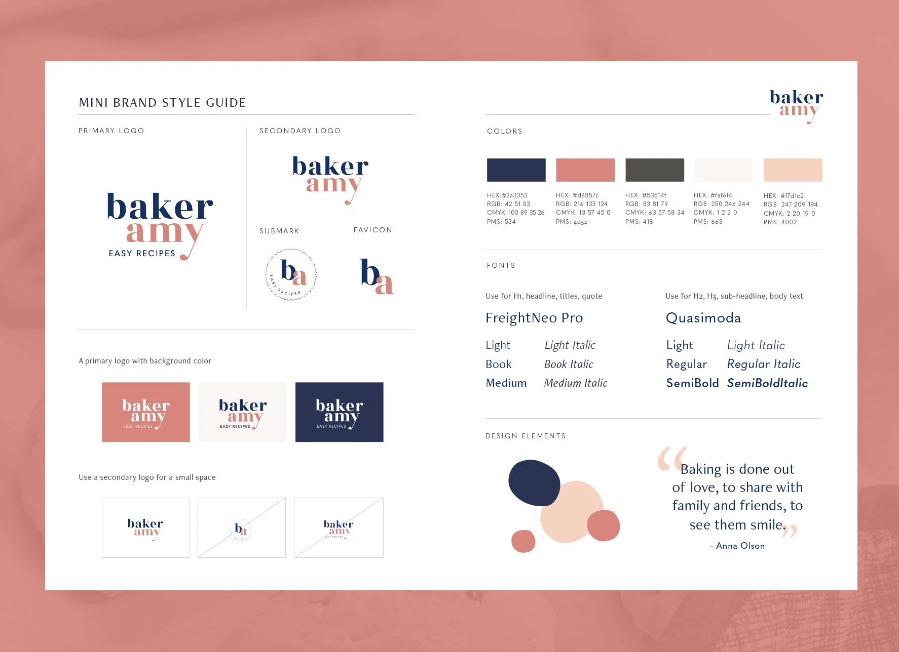
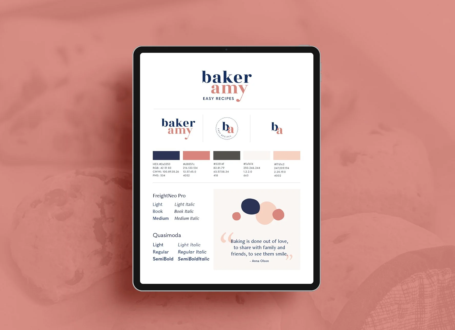
What is a brand style guide?
A brand style guide is a document that defines your visual identity.
It can be one page or an entire brand book — depending on your needs. For small businesses, a clear and simple version is often more than enough.
Your style guide typically includes:
Logo usage
Color palette
Typography
Imagery direction
It becomes your quick reference whenever you create:
Social posts
PDFs
Presentations
Website updates
Marketing materials
Instead of guessing, you follow your guide.
And that consistency builds trust.
Step 1: Build your brand foundation first
Before choosing colors or fonts, you need clarity.
Ask yourself:
Who are your ideal clients?
What is your purpose, mission, and vision?
What are your core values?
What feeling should people experience when they see your brand?
How would you describe your brand personality?
Your visuals should reflect your strategy — not the other way around.
If you skip this step, your brand will feel inconsistent no matter how beautiful it looks.
If you’re not sure about your brand direction yet, my brand clarity workbook can help you gain clarity before you dive into design.
Step 2: Create your visual identity
Here are the four essential elements to include in your one-page brand style guide:
1. Logo
Your logo is the cornerstone of your brand visuals. Your document should include:
A Primary logo
A Secondary and ( or ) submark logo
A lettermark or brand mark and (or) favicon
These are derived from your main logo. It’s typically smaller than your logo and is frequently used as a favicon or profile picture. A sub mark logo is particularly useful for companies with long business names.
If space allows, you can add the following to the document:
Minimum size and proper proportions of the logo
Clear instructions of the space needed around the logo
Variations in colors, black & white, and reversed
Images of how you don’t want your logo to be
Over time you may change your logo slightly as many companies do. Make sure to keep the latest logo up-to-date in your style guide.
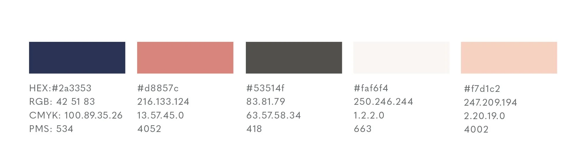
2. Color Palette
Your brand colors are powerful recognition tools.
When used consistently, they become associated with your business.
Include:
1–2 primary colors
2–3 secondary colors
HEX and RGB (for web)
CMYK (for print)
Pantone (optional)
Tip: Keep your palette simple.
A restrained color system looks more refined and professional — and it’s easier to maintain consistency.
3. Typography
Fonts communicate emotion just as much as color.
To maintain consistency, choose:
One primary font (often for headings)
One secondary font (often for body text)
Whenever possible, select fonts with full families (bold, italic, light, etc.) so you can create hierarchy while staying consistent.
You may also include:
Capitalization rules
Alignment preferences
Spacing and tracking guidelines
Small details create a polished feel.

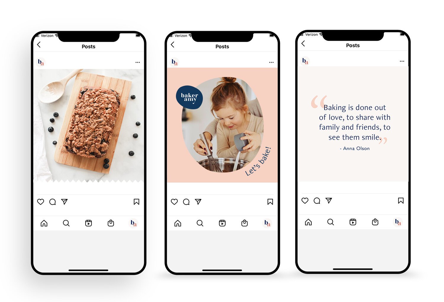
4. Imagery & Graphics
Your imagery should reflect your brand personality.
Ask yourself:
Do you want your brand to feel calm and airy?
Bold and energetic?
Minimal and refined?
Warm and organic?
Black-and-white photography creates a very different feeling than vibrant, saturated imagery. Soft lighting feels different from high contrast.
Make sure your imagery works harmoniously with your fonts and colors.
Everything should feel intentional.

Why a Style Guide Matters
A simple brand style guide:
Saves time (no more searching for old files)
Creates visual consistency
Helps designers and collaborators align quickly
Builds recognition
Makes your brand feel more trustworthy
Consistency isn’t about being rigid.
It’s about being recognizable.
When your brand feels cohesive, your audience feels confident.
And trust leads to growth.

If You’re Feeling Stuck…
Sometimes the challenge isn’t creating the guide.
It’s knowing whether your brand direction is clear in the first place.
If you’re unsure about:
Your visual direction
Your brand personality
Whether your current branding feels aligned
Or why your brand looks inconsistent
You don’t need a full rebrand yet.
You may just need clarity.
Brand Clarity & Design Direction
If you’re still feeling stuck creating your brand style guide, a focused Brand Clarity & Design Direction Session can help.
I’ll review your existing visuals and help you gain clarity around your brand direction, so you can move forward with confidence.
→ Explore Brand Clarity & Design Direction
Already clear on your direction and ready for a fully cohesive visual identity?