Event Planner Branding Case Study
It was a pleasure to work with The Dinner Party Department, founded by Maria Butsikaris. The brand creates thoughtful, beautifully planned gatherings that transform ordinary dinners into meaningful, memorable experiences. Every event is designed with intention, emotion, and story.
This custom brand identity design project focused on translating Maria’s rich creative vision into a clear and elevated visual foundation—one that feels bold yet personal, refined yet warm, and welcoming to those who value intimate, meaningful gatherings.
Maria has a highly creative mind and a strong artistic point of view. What she needed was a brand identity that could clearly express her unique approach to event design while standing apart from typical event brands.
Brand Clarity
The Dinner Party Department helps people envision, plan, and bring to life events that feel authentic to the host—while thoughtfully pushing creative boundaries.
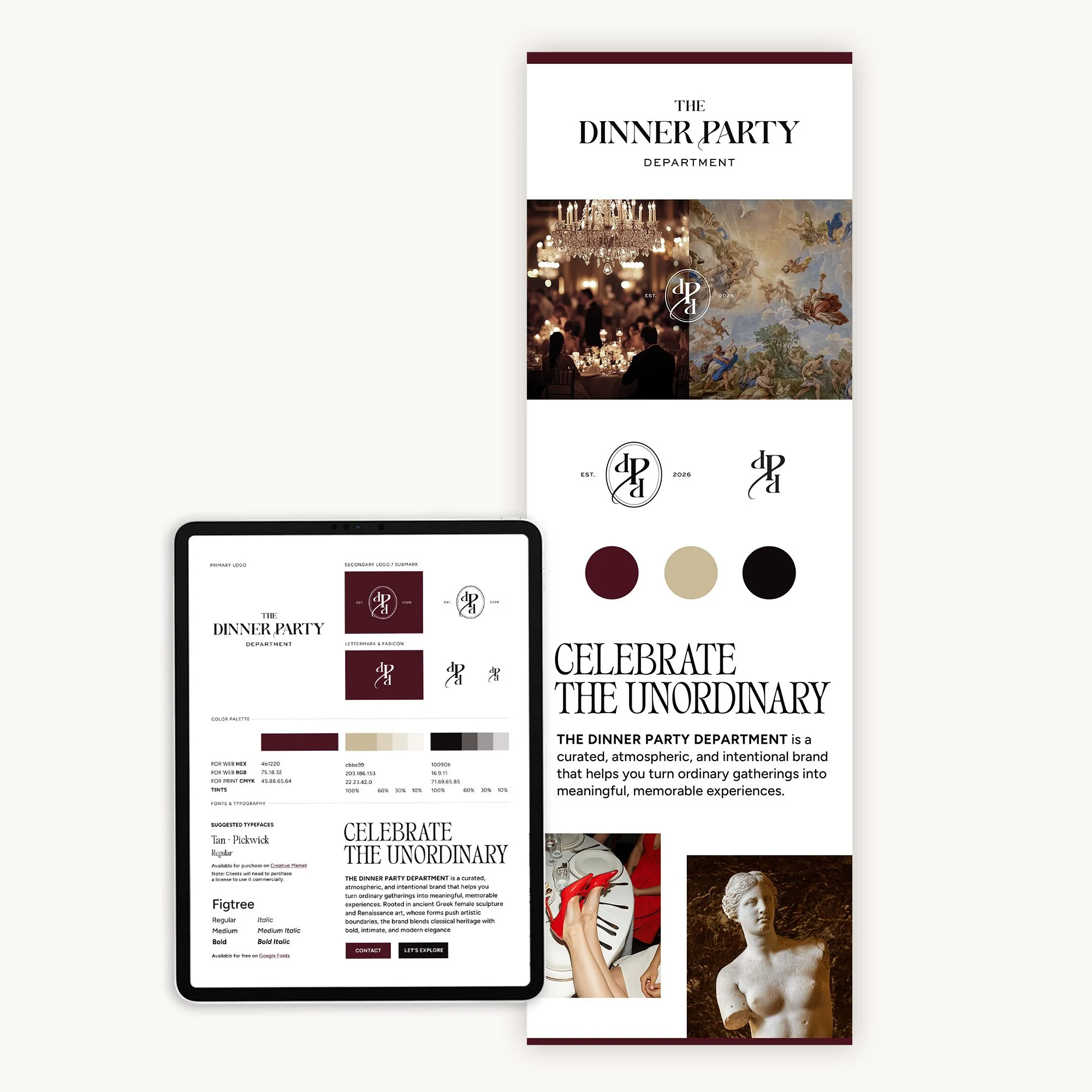
Maria is inspired by Greek mythology and Renaissance art, blending classic ideas with a modern perspective. One key reference is Aphrodite of Knidos, the first full-size female nude sculpture in Greek art, known for breaking creative boundaries. This symbol reflects her brand’s belief that events should go beyond traditional gatherings—transforming ordinary moments into personal, meaningful, and truly memorable experiences for the host.
The challenge was translating these rich historical and emotional influences into a modern visual identity that feels bold, elegant, and approachable—without losing depth or impact.
The brand is designed to feel luxurious yet welcoming, trend-aware yet timeless. It speaks to those seeking modern elegance and excitement, creating an instant sense of connection—a mix of comfort, trust, and spark—like finding someone who truly understands their taste and vision.
Creative Direction
Brand Clarity First
To begin, I gathered Maria’s questionnaire responses and visual references and created a series of brand mood boards. During our brand clarity session, we discussed visual direction and refined the ideas together. Our goal was to simplify complexity without losing meaning—creating clarity while preserving emotion and depth. Once the brand strategy was clearly defined, I moved confidently into the creative phase.
Brand Seasonal Personality
Using a seasonal framework helps clearly define a brand’s visual personality. The Dinner Party Department embodies a Deep Winter personality—bold, layered, and sophisticated.
The brand exudes confidence and drama without feeling overwhelming, balancing striking elegance with warmth and intimacy. It feels refined yet approachable, aspirational yet deeply human. This deliberate and precise energy invites connection and inspires hosts to create gatherings that are emotionally resonant and visually striking.
Logo Design
Maria wanted a logo inspired by Greek mythology and Renaissance art—creative without limits, rooted in tradition, yet modern and bold.
The Dinner Party Department blends classical heritage with unexpected creativity. Inspired by Aphrodite of Knidos and Renaissance ideals of beauty, the logo celebrates authenticity, emotion, and transformation, turning ordinary gatherings into meaningful experiences.
Both logo options explored the letter P as a symbol of the female form, echoing the elegant curves and draped lines of classical sculpture. This approach balances tradition with modern elegance.
The final logo uses a classical-modern typeface that feels elevated, timeless, and sophisticated. Traditional letterforms are paired with subtle shapes referencing the feminine form, adding depth, personality, and refinement.
After reviewing some options, Maria chose the design that best captured the balance of heritage, boldness, and intimate elegance.
Rooted in the legacy of Aphrodite of Knidos—the first female nude sculpture to challenge artistic boundaries—the brand reflects a harmony between refinement and warmth. Just as Aphrodite revealed the human form with grace and honesty, The Dinner Party Department transforms everyday gatherings into personal, unforgettable experiences.
Brand Board & Style Guide
The brand board and style guide ensure consistency across all platforms. A minimal, intentional color palette makes it easier to create marketing materials while helping the brand stay recognizable and memorable. Together, the visual elements clearly communicate The Dinner Party Department’s overall look and feel—modern, confident, expressive, and refined.
KIND WORDS FROM THE CLIENT“I recently worked with Natsumi on creating a logo and mini brand identity, and I’m truly so happy with my decision to partner with her.”
She took my ideas and inspiration and transformed them into something timeless and professional, while still capturing the fun, bold vibe I wanted. I felt she genuinely listened to my preferences, was receptive to feedback, and maintained timely, consistent communication throughout the entire process.
Everything felt very professional and organized. I would highly recommend Natsumi to anyone starting a business and looking for support with their brand identity and logo!
Maria Butsikaris, Founder of The Dinner Party Department, USA
Outcome
This project transformed Maria’s complex creative ideas into a clear, cohesive brand identity. The Dinner Party Department now has a visual presence that feels confident, personal, and refined—inviting people to create events that connect deeply and leave lasting memories.
By turning depth into clarity and designing with intention, the brand now clearly communicates its purpose: helping hosts create thoughtful, personal, and unforgettable experiences.
I’m excited to see Maria’s business grow as she begins this new chapter in 2026.
Have ideas but aren’t sure how to express them through visual identity?
Explore my my brand design services for small businesses or get in touch to start the conversation.

